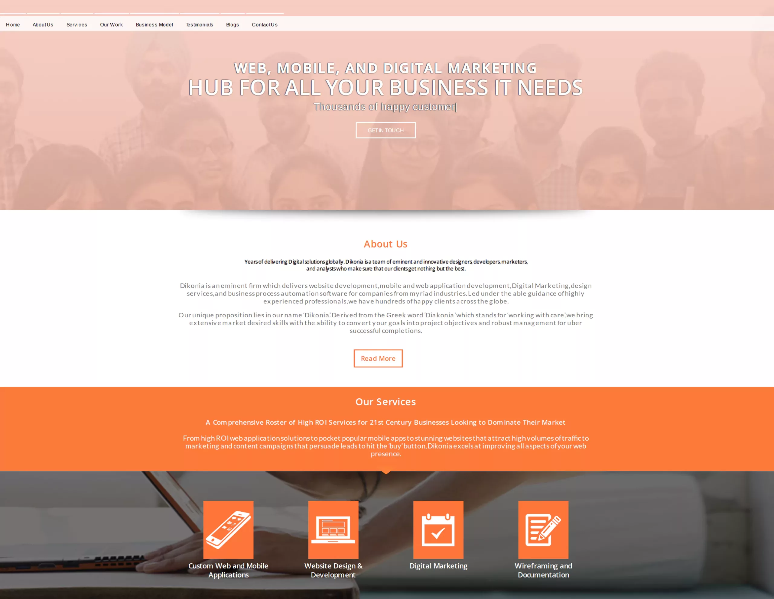
Websites are no more limited to a digital presence, they now represent your brand value and credibility.
By 2020, not having a website for your business will become obsolete. This fact clearly depicts that a lot of new websites are going to populate the internet in coming few years and you need to own one of them.
The competition to acquire a valuable corner on the world wide web is going to become even more serious. Consequently, you’ll need to pay more attention to your corporate website development.
We get it, as a business owner, you have thousands of other things to worry about than your website’s font. But you should be knowledgeable about the critical elements of your website, rather than approving whatever the developer throws at you.
Understanding some working principles of web design will help you make sure you’re not losing out on your online brand value and reputation.
4 Critical Tips for Corporate Website Design
Keep the Site as Clean as Possible
In contrast to e-commerce and news websites, corporate web design is free of clutter.
The primary purpose of your corporate website is to communicate useful information about your company to the visitors. And everything that doesn’t qualify as useful information must be removed.
Examples of unnecessary content on your website
- Large pictures covering significant parts of the screen with no relevance to the content.
- Long paragraphs explaining your services on the front page.
- Social Widgets at several different parts of the website.
- Big map boxes showing your office location.
Adding more white space on the website and maintaining a clear contrast for useful information, makes the website easy to digest. The visitor can clearly point out important elements such as contact information, service details and query forms.
Furthermore, the website real estate must be used wisely with an eloquent mix of graphics and text. Too much text and too much graphics, both becomes issues. Hence, keep it subtle yet expressive at the same time.
Make Navigation Simpler
The website visitors must not have trouble finding important pages such as “About Us”, “Our Services” and “Contact Us”. The links to these pages should be obvious to locate and clearly visible above the fold.

There are a number of ways for making navigation simple but they’re subjective to the design of your website.
The simplest way is to keep a sticky navigation bar that follows the visitor as they scroll down. It makes sure that these links are accessible at all times to the visitor.
Then, you can break the page down into smaller segments containing a link to each of the above mentioned pages. This makes sure that the visitor gets to notice these pages as they inspect the site.
Lastly, you can add a hamburger icon to the website which will concisely enclose all the important pages without taking extra space. Users can instantly access these pages whenever they feel like. This is a great tactic to make the website mobile friendly.
Invest Wisely in the Front End Design
The front end or the part of the website that will be displayed to your audience at all times needs to have an eye-catching design.
If the users are wooed by the aesthetics of your website, you have won half the battle towards wooing them for your business. This can be done by taking care of simple design elements as discussed below.

A Professional Logo: Get a professionally logo designed, don’t try to sketch it up yourself or get it cheaply made. A thought provoking logo speaks more to the visitor than all of the text combined.
A Corporate Theme: If your website runs on WordPress, you can easily choose from a wide variety of corporate themes available on the internet. If not so, spend some time on deciding a continuous theme for the entire website.
Smooth Transitions: Animations such as loader clocks, pop-up transitions and scrolling effects are considered to be UX enhancing. You can keep a bunch of them on the site to make it look impressive.
Non-Stock Photography: Invest in original copyrighted graphics for the website rather than settling for the free options. Free stock photos get circulated a lot around the web and noticing such imagery can instantly decrease user confidence.
Invest Heavily in Performance
Performance aspects such as site loading speed, the arrangement of content, mobile responsiveness and onclick events are key indicators of the website’s credibility.
A study found that 88 percent Americans are likely to attribute poor performing website to the brand’s market competitiveness.
This simply means that if your website has visible issues such as faulty buttons, broken links or a slow loading speed, your visitors will think you’re company is the same.
This is but natural. An underperforming website sends the signal that you haven’t invested in a quality website developer and went for a cheap fix. Which puts down expectations for your business.
While this is still ignorable for e-commerce and blog sites, it screams in the face for corporate websites.
Conclusion
The gist of the article is that just like you don’t leave any stone unturned in ensuring the best business offering to your customers, you shouldn’t compromise in any aspect of your website.
The above design and UX tips will make you standout from the competition and communicate a strong business value to your audience.
You can go ahead one step and contact us to discuss more about you website and how we can add value to it.

